1. A nightmare on Elm Street:
The title of this film gives me an idea of what film genre it categorises, Horror. A nightmare is often related to a very scary or traumatising dream which could often leave someone in shock or create a permanent state of fear towards what their nightmare was based on. The words “Elm Street” could suggest the location of the film.

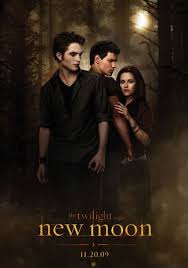
The title itself hints a fantasy story line, the words “saga” tells me that it is a series therefore it should have more film releases. The words “new moon” supports my idea of the film being of a supernatural and fantasy genre, This is because normally in films of a supernatural nature you link werewolves with the moon. Fore example in the late Michael Jackson´s Thriller video, the story line at the beginning shows him stereotypically transforming into a werewolf at the first sight of the moon.
http://www.youtube.com/watch?v=p_MuUcxHATo&ob=av2e
This is a poster for the release of New Moon. The font used in the title gives of an ancient feel, as the colour looks quite dated and almost moon lit. The italic font uses straight linear lines, this gives off a cold feeling. The images used in this poster show reference to a love triangle. the female character has a strong hold on the middle male character suggesting affection for the male. The middle male is in a very defensive position with his back turned the Caucasian male he also has his fists clenched tightly and his face is tilted to the side giving a very strong look at the Caucasian male this is telling me that they may be tension between them. The Caucasian male looks very protective of the female character as his eyes are fixated on her and his hands are almost fist like. This tells me that the relationship between each character will be tested in the film and this reveals some of the events that will take place in the film.


No comments:
Post a Comment