Friday 24 September 2010

Applying recognizable conventions of a trailer

In order to play with the recognizable conventions of a trailer , in groups, we came up with ideas of how to market and promote a film called 'Bloodshed High'. Firstly we discussed a story line for Bloodshed High and then we discussed what our unique selling points were (USP). This gave me a chance that to learn how trailers work to engage their audience and i also learnt that the Trailer is an advert for a film and not to be classed as a film.
When having group discussions with my team, Sonia and Nasrine. We spoke about how important it is to specify your USP in a trailer, it allows the audience to have a short insight to the film and allows a hype to begin so we decided how the trailer would start and end and what effect we would like this to create. We looked at many actors when deciding who our main female role would be cast by, Blake Lively was chosen because of her huge young adult fan base through her leading role in Gossip Girl, this is good exposure to the film as our film will be of a 15+ rating and the target audience for the TV hit teen drama Gossip Girl is of the same target.
The production company taking charge of the film will be TWISTED PICTURES, this production company gained wide attention through their work in the SAW series. During the trailer we will show that Twisted Pictures will be taking part in the creation of 'Bloodshed High', this will give the movie good exposure as everyone who sees the compony in co-operation with the movie they would want to see their latest work. Most Saw fans will recognize the production logo and instantly fall for the trailer and want to see the film.
Directing the film, James Wan.
The movie trailer will be posted on Youtube, Facebook, MySpace and Twitter, and any other social networking site. This is to maximize the chances of the target audience viewing the trailer. The trailer will be aired on TV at 9:30 onwards again to try and maximize the chances of our target audience viewing our Ad.
Through what we have learnt from Media we decided that it will be best that our movie title should be shown at the end of our trailer following faste paste shots of action and blood scenes accompanied by eeire music to set the tense creepy horror feeling when watching the trailer.
Points which I learnt in the excerise
  • How to engage the audience
  • How to apply previous and current learned knowldege to set tasks


Monday 13 September 2010

Analyzing a film trailer

'Let Me In'

We are told the name of the film at the end of the trailer emphasing the young girls desperate need as a vampire to be let in and it has been said as a tale that vampires 'always come knocking' for their victims. We see all types of action such as the typical strange supernatural characteristics of a vampires to be jumping up trees, walking bare foot and attacking people. The music plays a key element as it is very mysterious yet alert just like the title and the tempo quickens as parts of the scene begin show action. The speed alters through the trailer as we are going through a short story board in the beginning of what happens but then as we SEE what happens camera shots and editing increases rapidly.
The trailer is definitely more effective as it shows the troubled actions of the young vampire and what she is capable of whereas the poster shows us a lot less but would still grab attention so it could work both ways. This kind of remarkable trailer would definitely be seen in a movie theatre rather than a TV ad to lure the viewer
more into watching it and it would be a good taster for a cinema atmosphere.

Whilst watching the trailer to 'Let me in' I realized that they make the audience aware that the same producers that are creating 'Let me in' were the same producers responsible for 'Cloverfield'

Sunday 12 September 2010

Which is more important, images or words?

Many may ask which is more powerful when it comes to advertising a newly released film, words or images?. It could be said that both are very vital when advertising a film they both have strong advantage when appealing to their chosen target audiences.
Images are strong in a sense that they are what people would focus on more, for example just the logo or motif of a product will make the product sell more so if they apply this method on film posters they could make the image speak louder than the title, therefore catching the attention of more people than usual. The average person will say that there going to go and see a film because it looks good, this is another example off the image being stronger than words, an image can reveal the nature of the film using different screen shots from various scenes of the film. Therefore the audience can reassure themselves with a visual and an understanding of what kind of story line will take place within the film. As well selling the film with the images they will be promoting the actors, this gives the film an even bigger advantage when advertising with images because there are many fans who go to watch a screening to see the work done by certain actors. Thus giving the film a broader audience to advertise to when using images.
On the other hand, words, in depth have so much meaning and if analysed properly could reveal a whole story line. When it comes to film titling I think that the words used are thought about very carefully. Certain films have a certain target audiences, so when they choose their title they will be sure that their audience will understand the meaning and significance of the name and also appeal to them, the trick is to reveal but never to much other wise the plot could be ruined.
In my personal opinion I believe that words are actually more important. They carry a secret meaning and when studied in depth with a proper analytical mind you can discover the true meaning and agenda of the film and not to mention you will understand why it was that a film has been given its name. Films can reach out to their specific target audience


Thursday 9 September 2010

Analyse three movie covers and title, talking about images and font?


1. A nightmare on Elm Street:

The title of this film gives me an idea of what film genre it categorises, Horror. A nightmare is often related to a very scary or traumatising dream which could often leave someone in shock or create a permanent state of fear towards what their nightmare was based on. The words “Elm Street” could suggest the location of the film.

This is the poster for the film A nightmare on Elm Street. The font used is very eerie and creates a cold chill. The title in the poster is slashed, possibly foreshadowing events that will take place in the film. The silhouette against the red background strikes fear because it disguises the true identity of the beholder. This compliments the idea of the film being a nightmare as it not only depicts fear but also a sense of ambiguity, whether asleep or awake.
2.Twilight saga: New Moon:

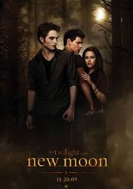
The title itself hints a fantasy story line, the words “saga” tells me that it is a series therefore it should have more film releases. The words “new moon” supports my idea of the film being of a supernatural and fantasy genre, This is because normally in films of a supernatural nature you link werewolves with the moon. Fore example in the late Michael Jackson´s Thriller video, the story line at the beginning shows him stereotypically transforming into a werewolf at the first sight of the moon.

http://www.youtube.com/watch?v=p_MuUcxHATo&ob=av2e

This is a poster for the release of New Moon. The font used in the title gives of an ancient feel, as the colour looks quite dated and almost moon lit. The italic font uses straight linear lines, this gives off a cold feeling. The images used in this poster show reference to a love triangle. the female character has a strong hold on the middle male character suggesting affection for the male. The middle male is in a very defensive position with his back turned the Caucasian male he also has his fists clenched tightly and his face is tilted to the side giving a very strong look at the Caucasian male this is telling me that they may be tension between them. The Caucasian male looks very protective of the female character as his eyes are fixated on her and his hands are almost fist like. This tells me that the relationship between each character will be tested in the film and this reveals some of the events that will take place in the film.


3. Boogeyman
The name of this title sounds very familiar, as it would to many who have heard of the story's as a child.
The bogeyman is a legendary monster used by parents often if their child is naughty, it is told that the bogeyman will get them, in an effort to make them behave.Titling the film " Boogeyman " reveals the basis on which the film will be about. Thus creating an instant fan base of everyone who has heard the story of the Boogeyman.
The film poster adds to my idea on the film revolving around the child conception of the Boogeyman man who lives resides in the cupboard, this is made apparent on the poster. The lighting is black which emphasises the fear of the dark and tells me that the film will most probably filmed mainly in low lighting. This also informs me that maybe The Boogeyman is more powerful in the dark. An image of a hand is visible due to minimal lighting, this could indicate a struggle taking place in the film with a character.